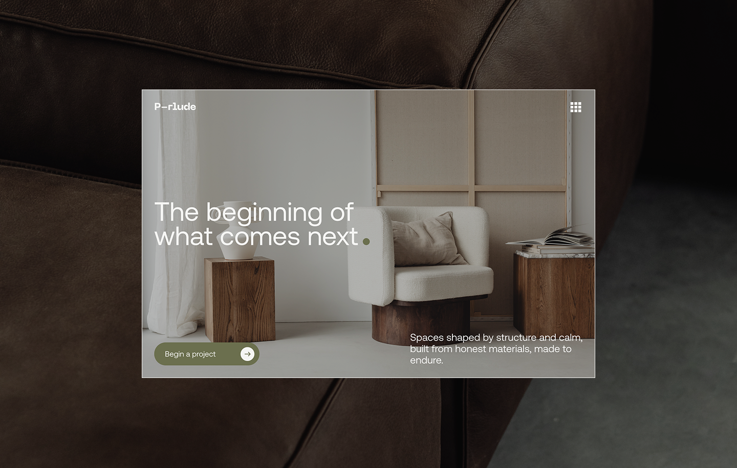
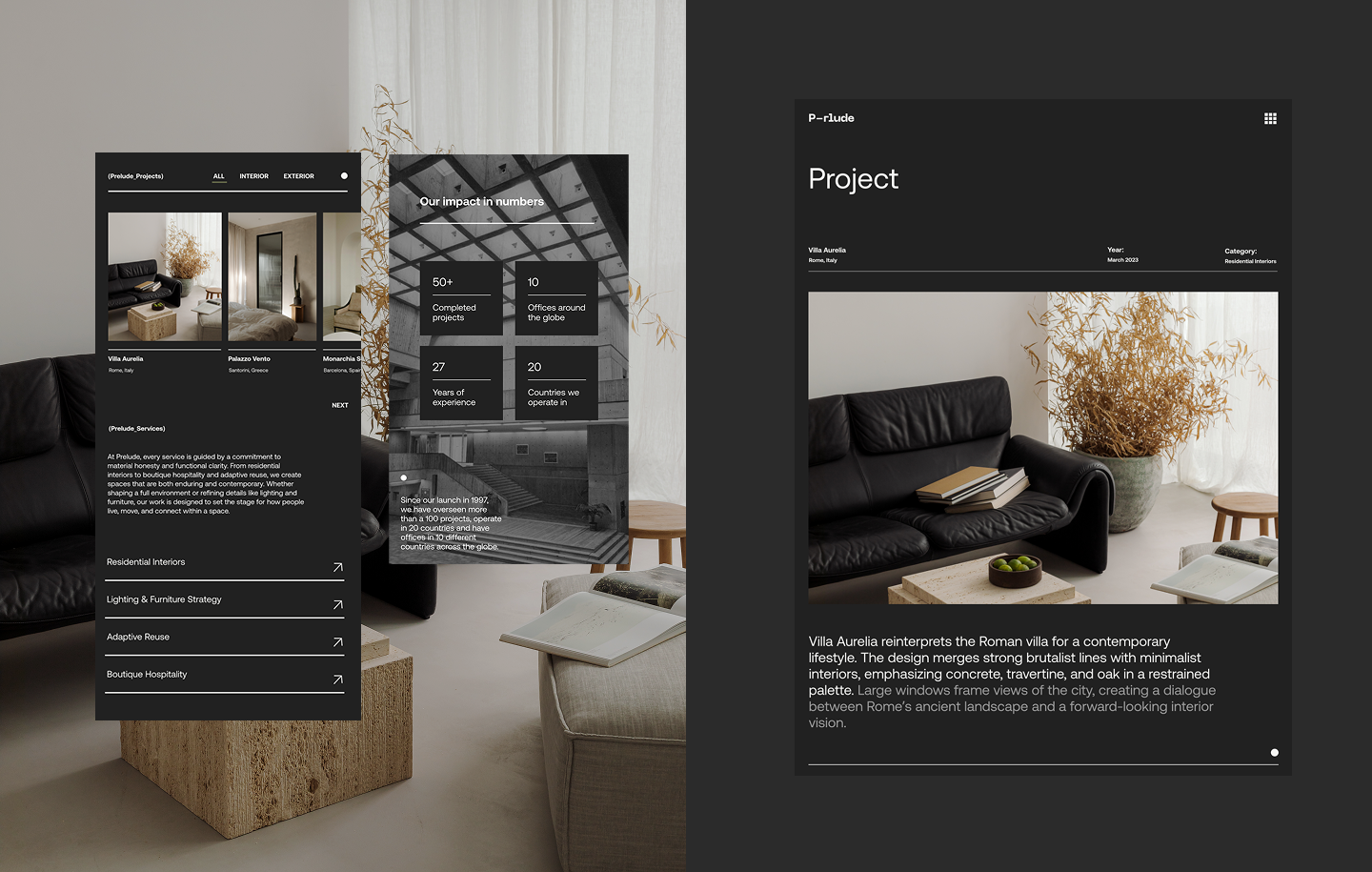
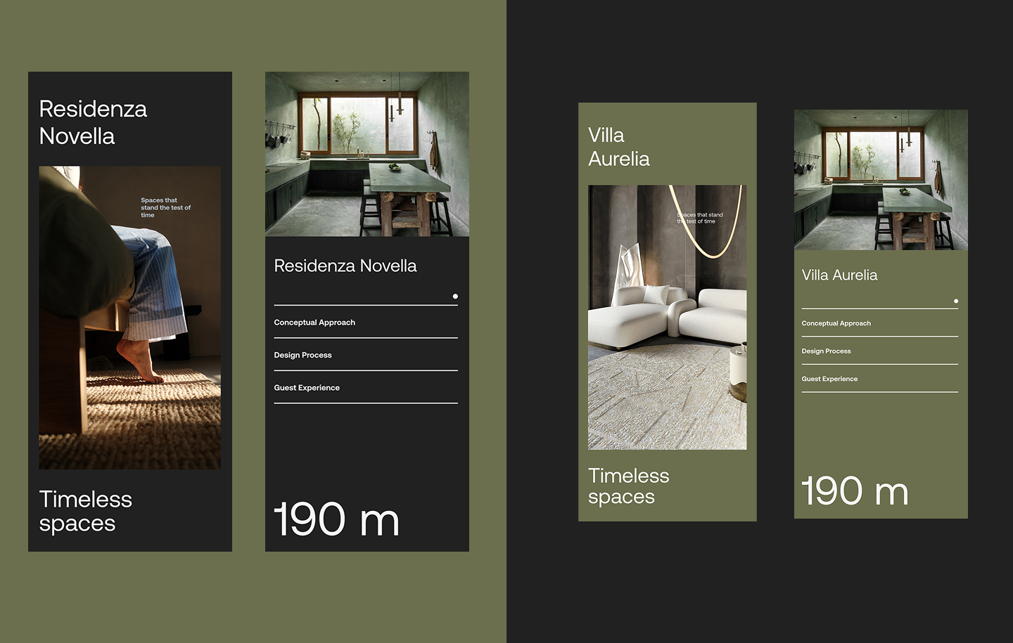
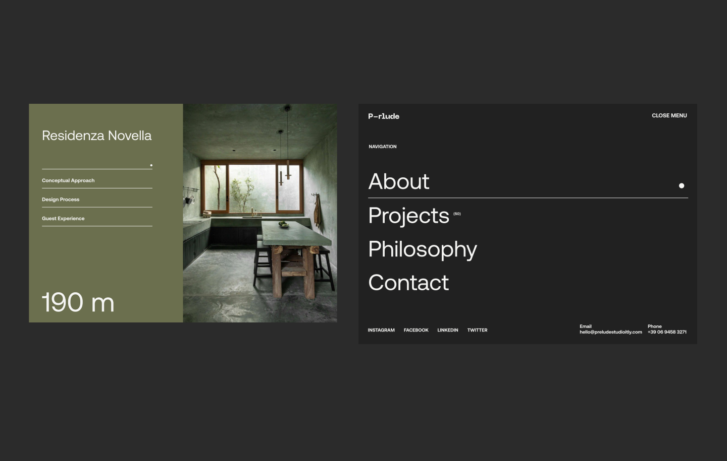
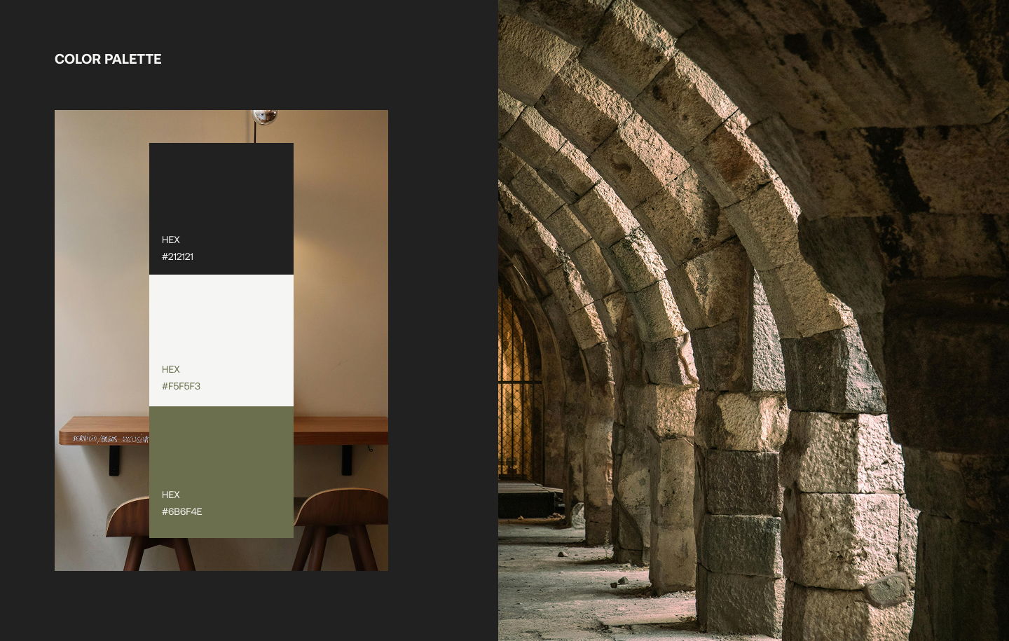
The name Prelude shaped the entire creative direction. Every design begins with what came before. That idea guided the visual identity toward something that felt historical and forward-looking at the same time. Brutalist structure provided the bones, raw, honest, and permanent. Minimalism provided the edit, stripping everything back to what was necessary. The result is a brand that does not decorate itself. It simply stands there and holds its ground.