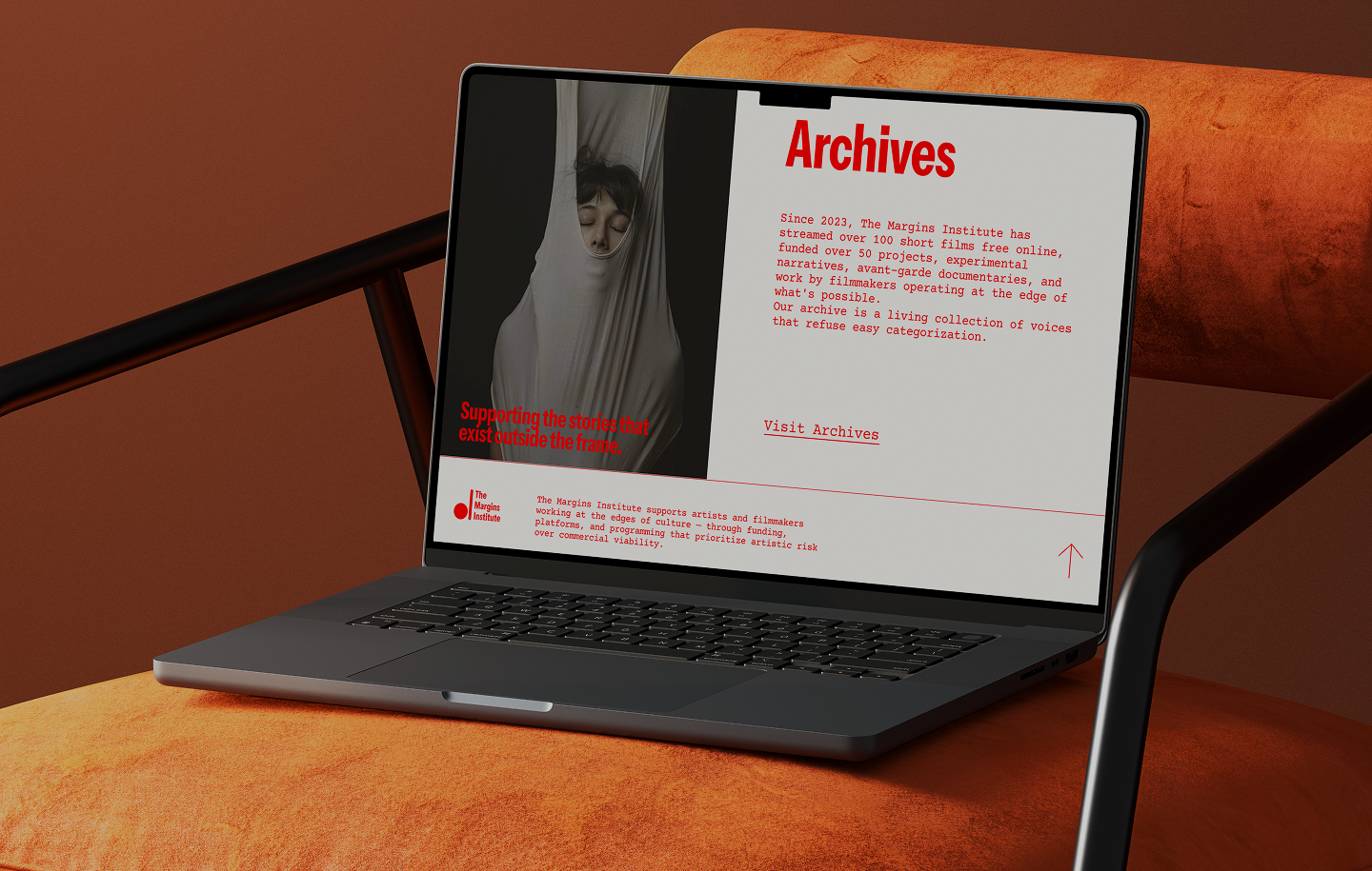
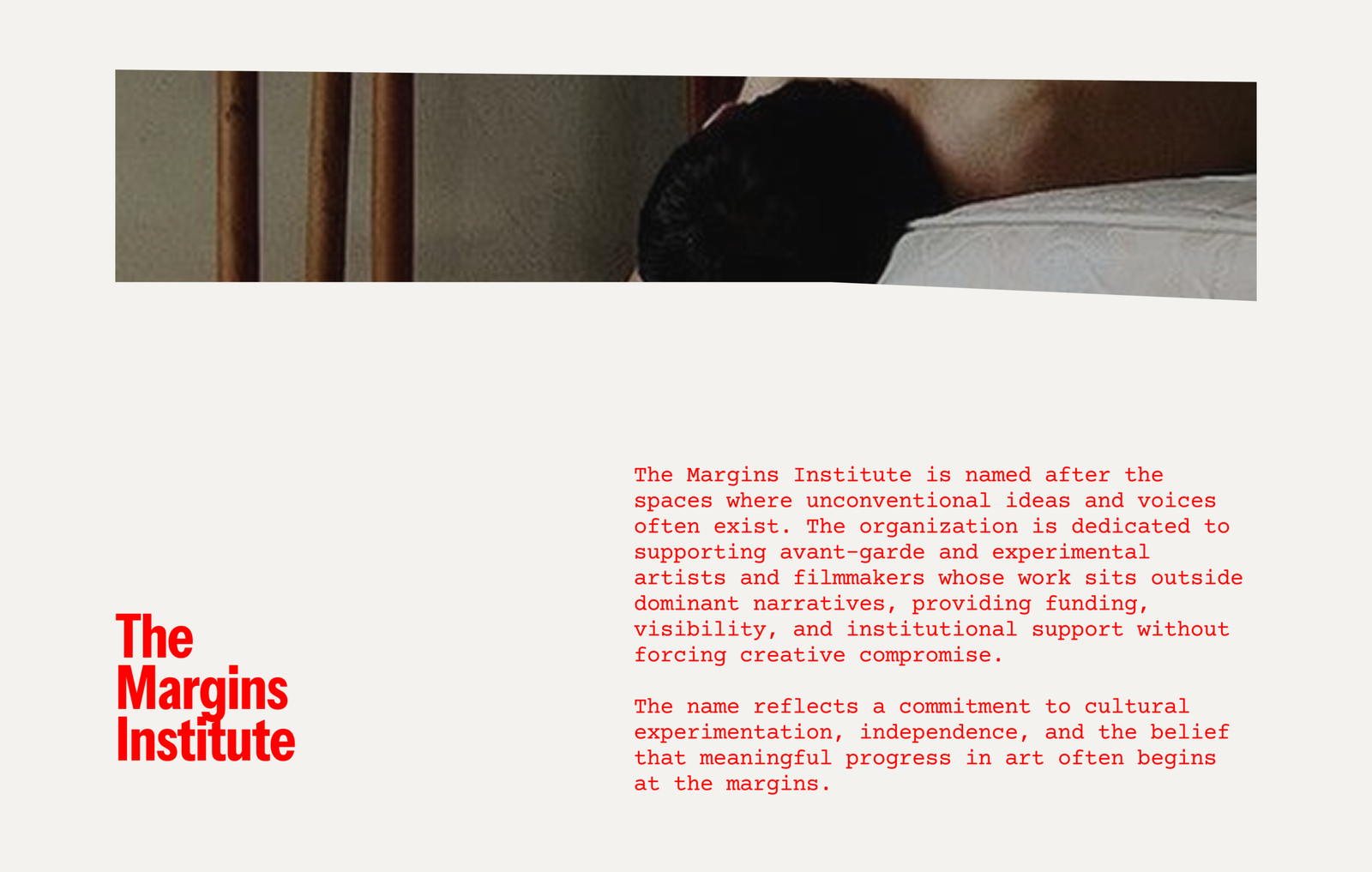
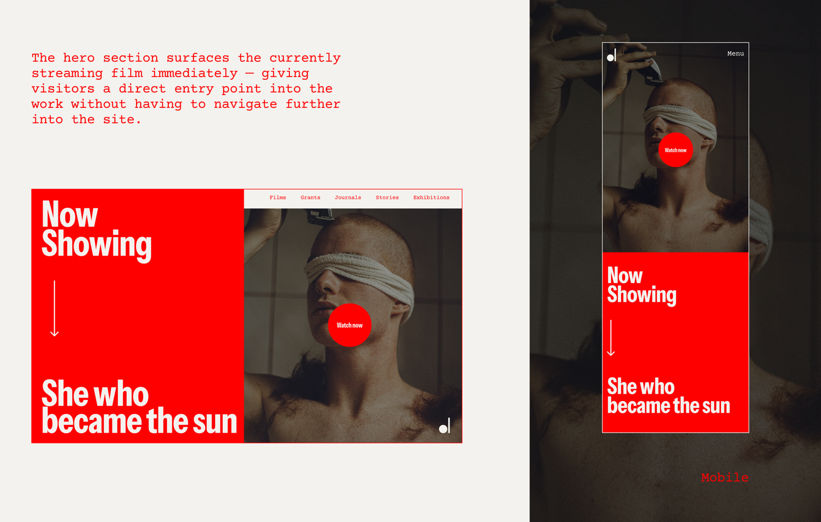
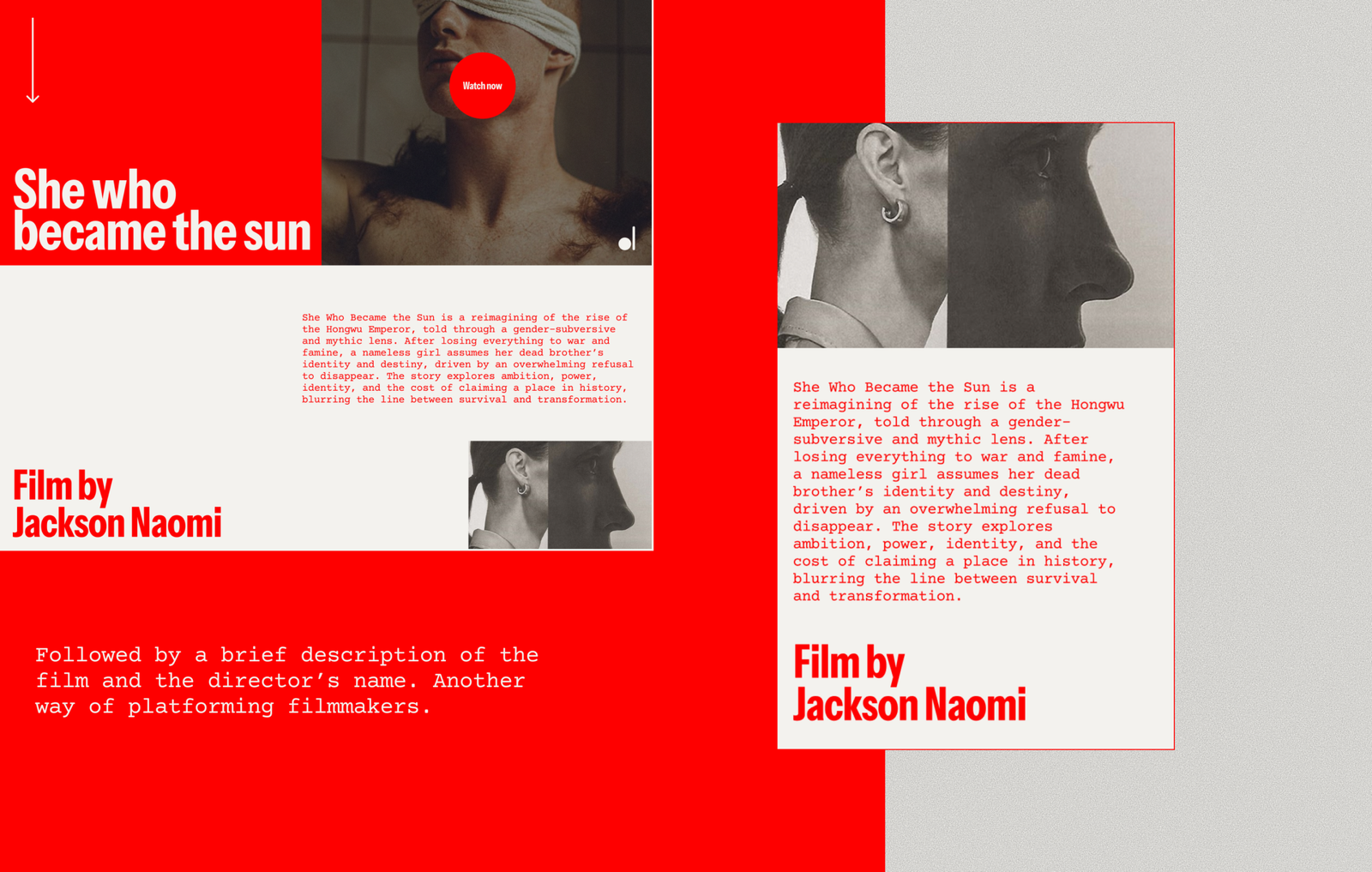
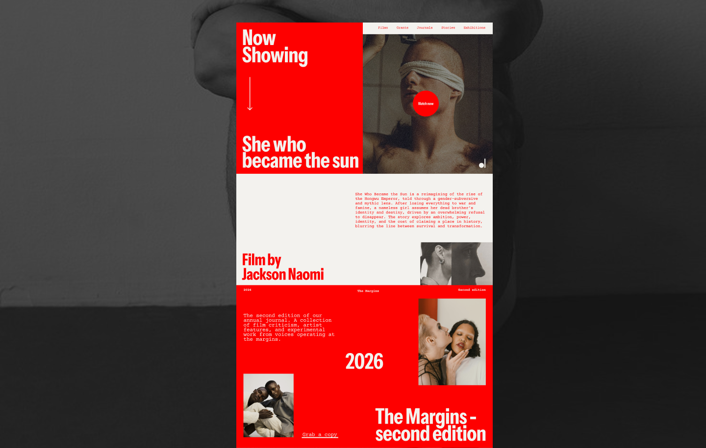
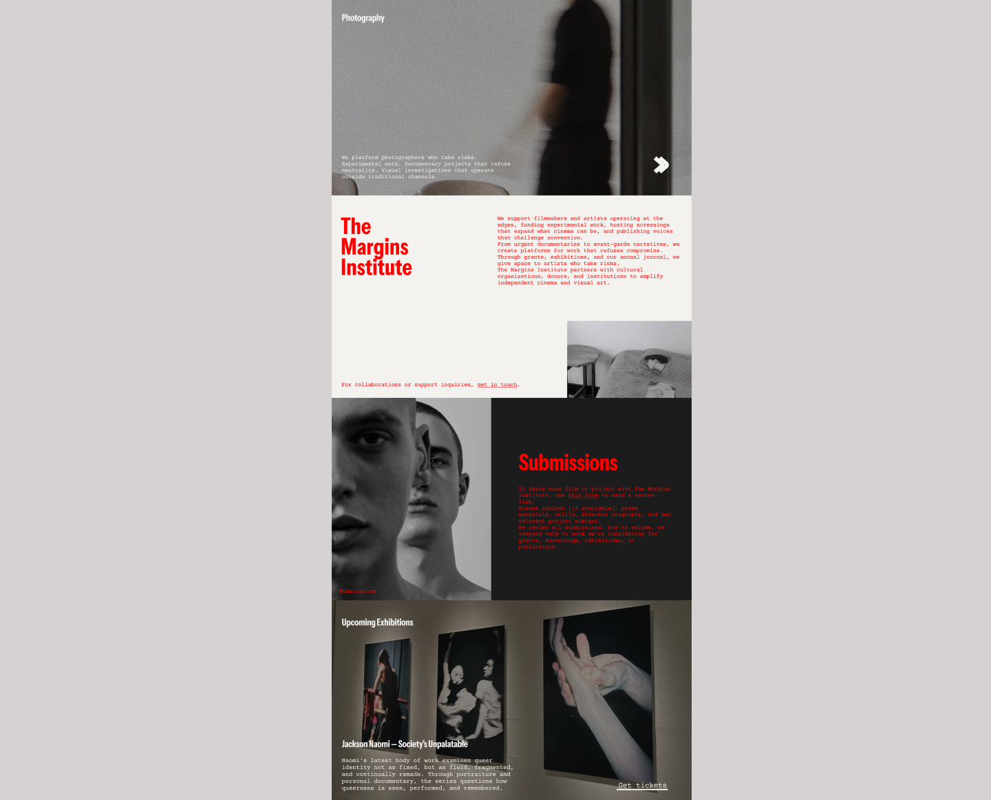
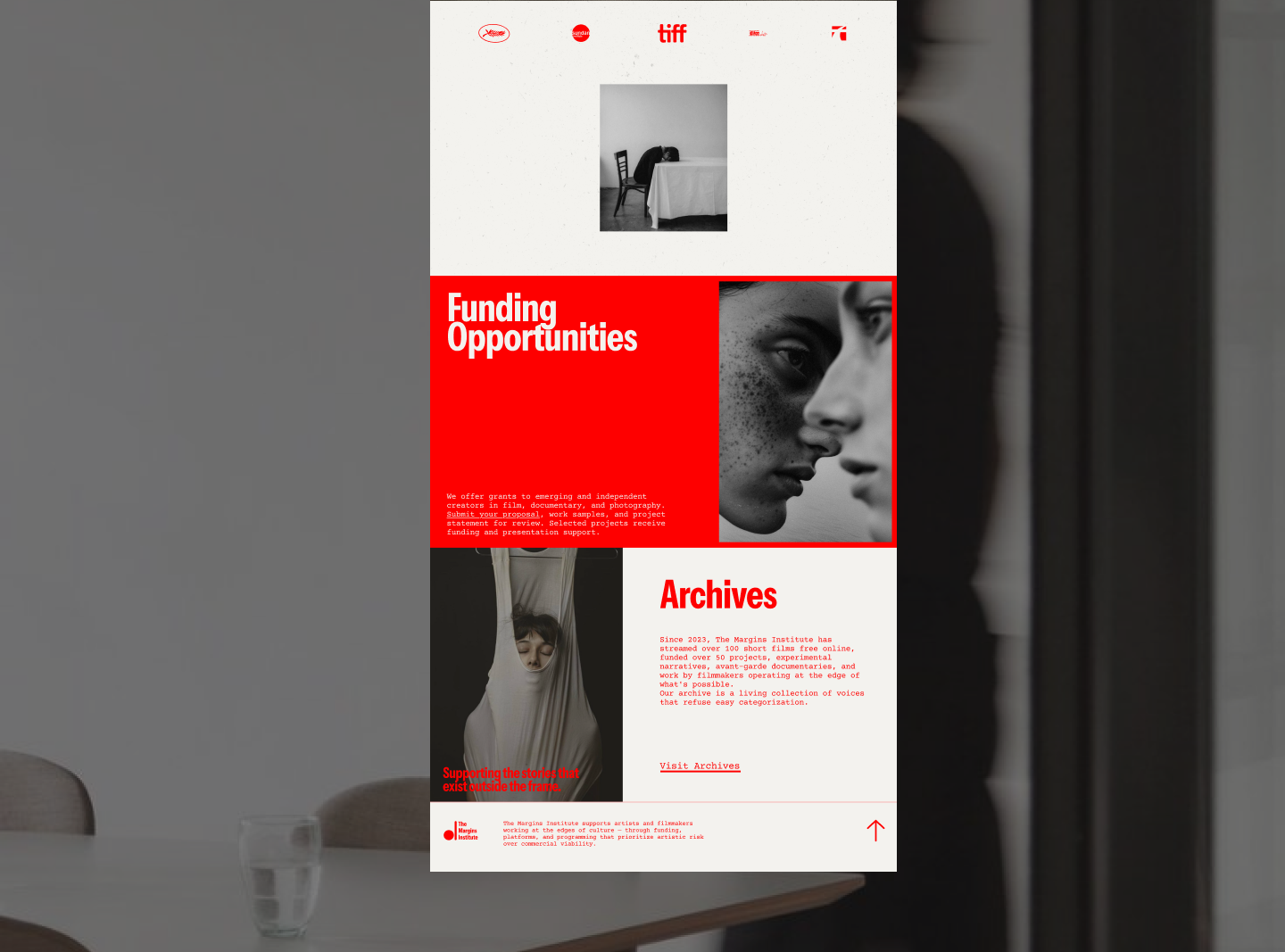
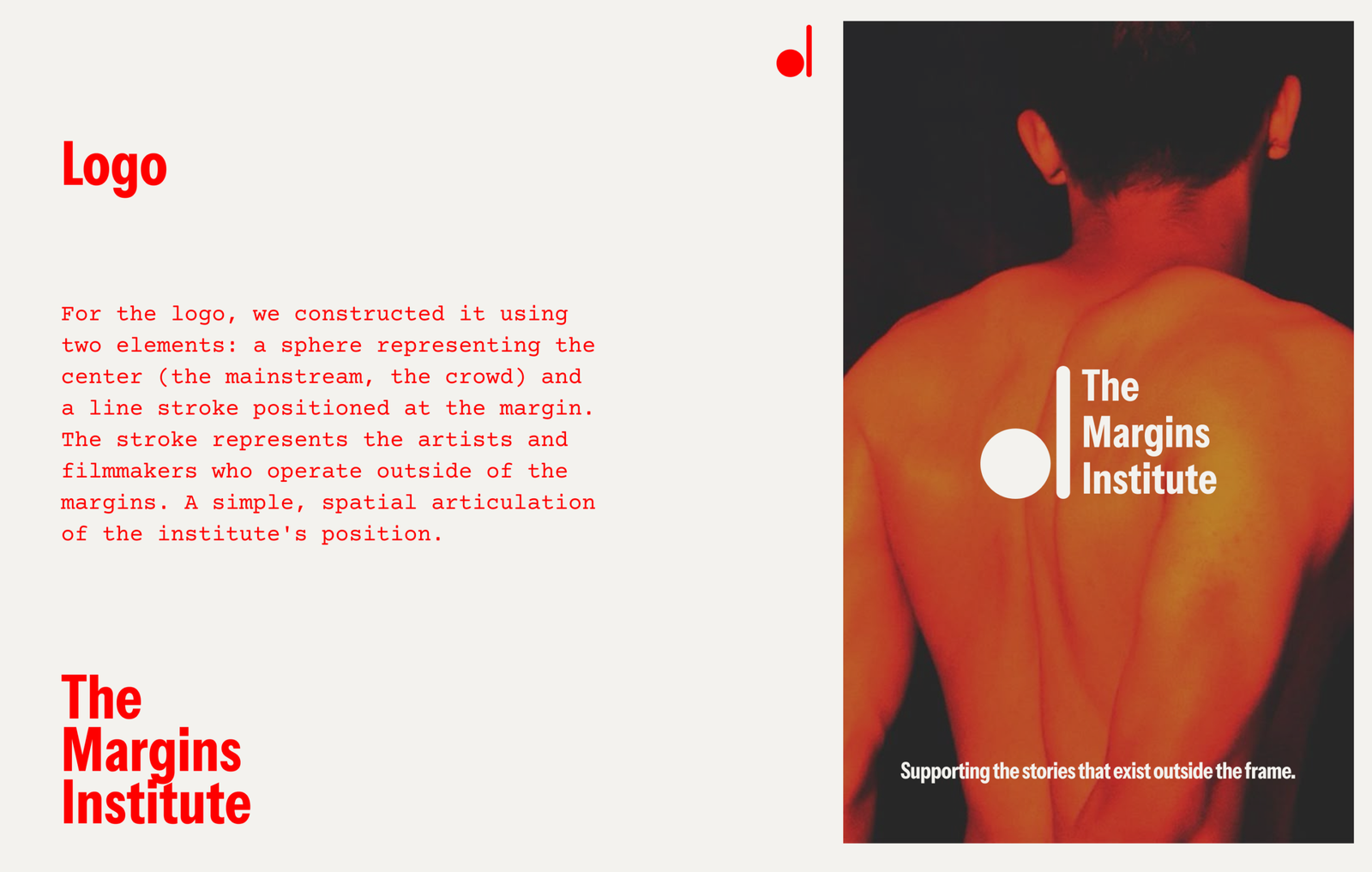
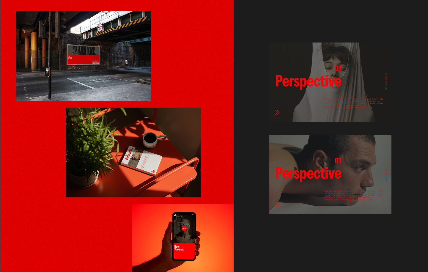
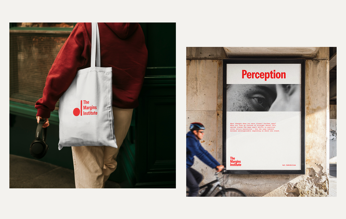
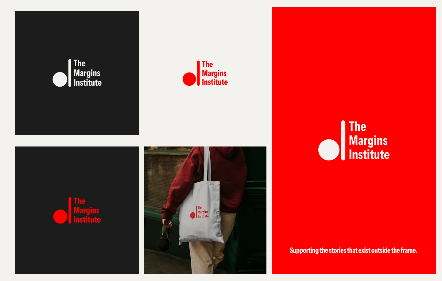
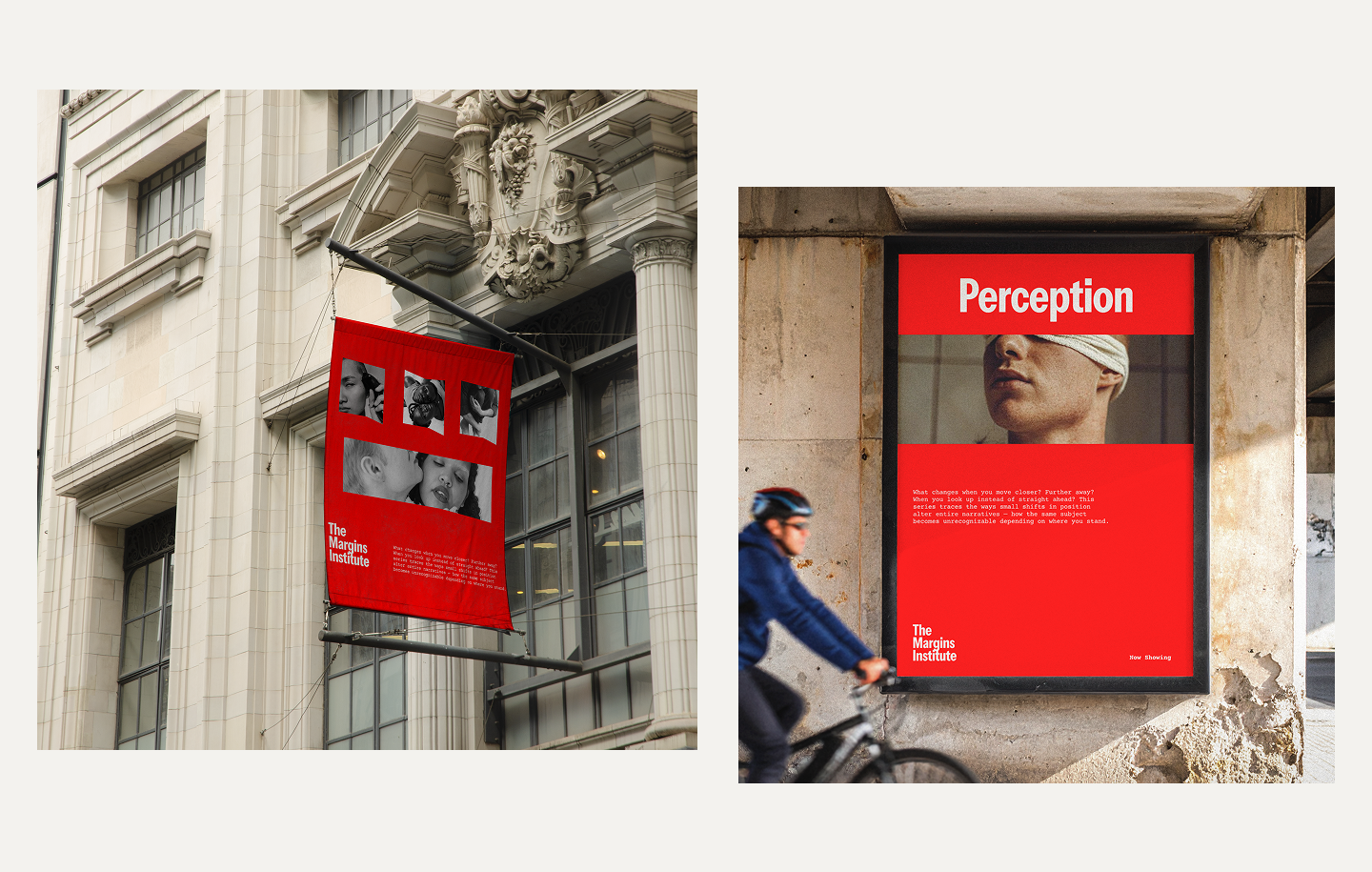
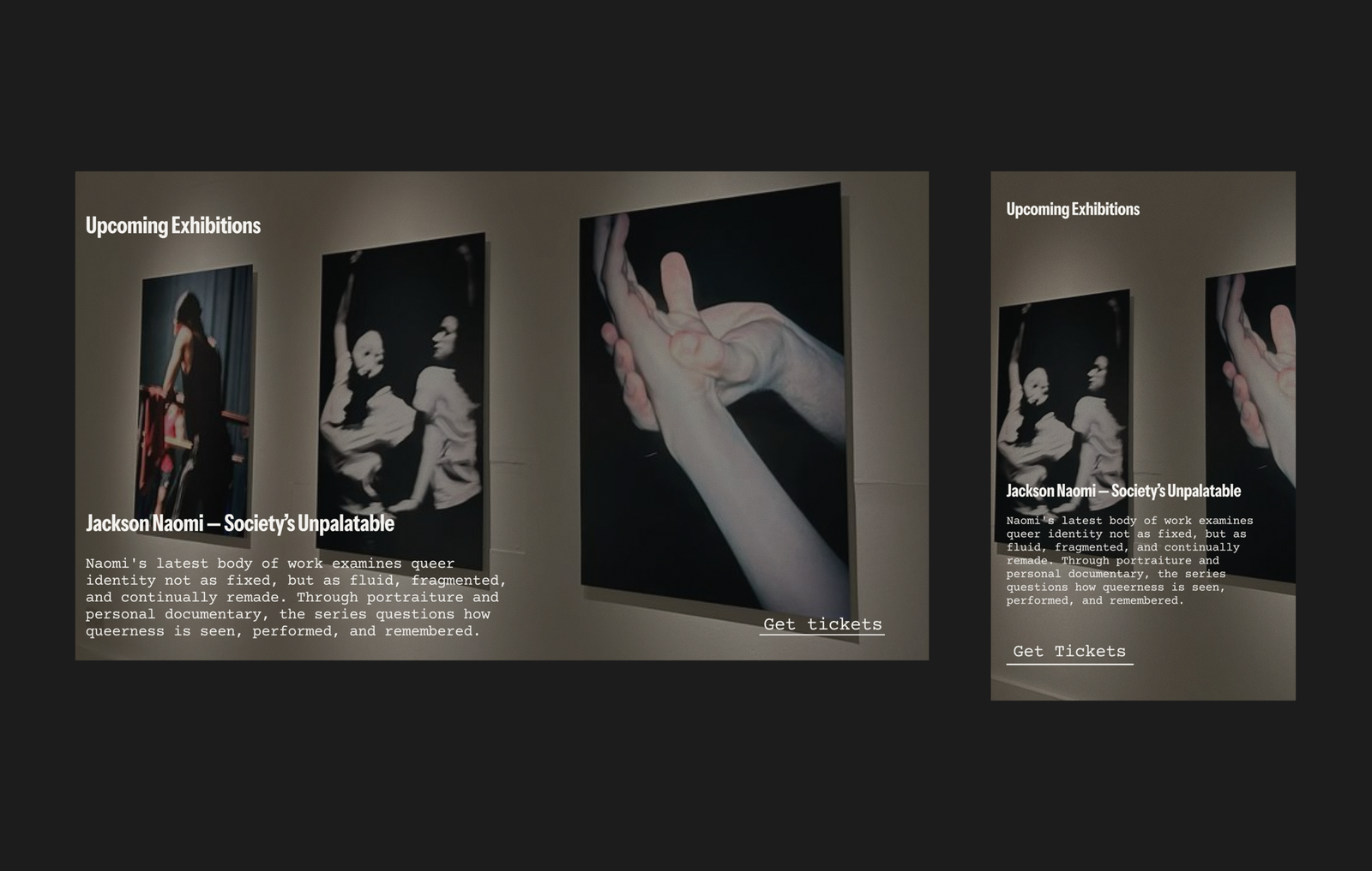
The design was built around cinematic restraint. A minimal palette of off-white and a single reddish orange accent. Editorial typography that lets the artwork lead. The logo was constructed from two elements, a sphere representing the center and dominant cultural narratives, and a line stroke placed beside it representing the margins and the voices that exist outside them. The website was structured to serve multiple functions, a grant application system, a streaming archive, an editorial journal, and an exhibition programming hub, without any single function overwhelming the others.